Darran Tiernan, ISC and Pankaj Bajpai are a cinematographer and colorist duo whose collective work includes some of the most visually distinctive television today, with titles in their credits including Westworld, Winning Time: The Rise of the Lakers Dynasty, American Gods, Bridgerton, and House of Cards.
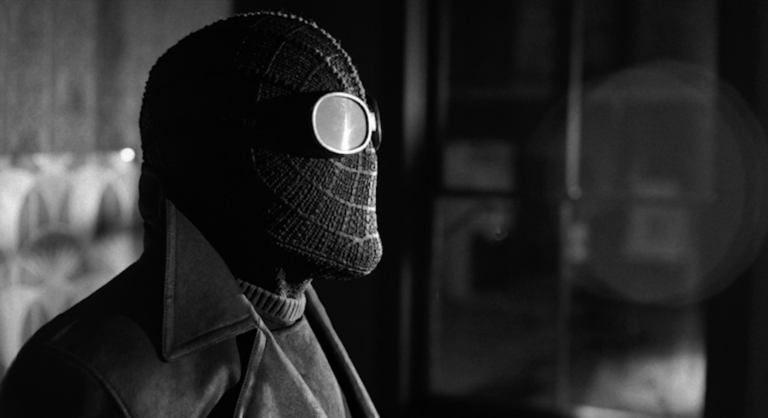
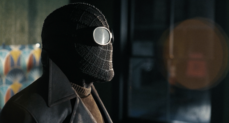
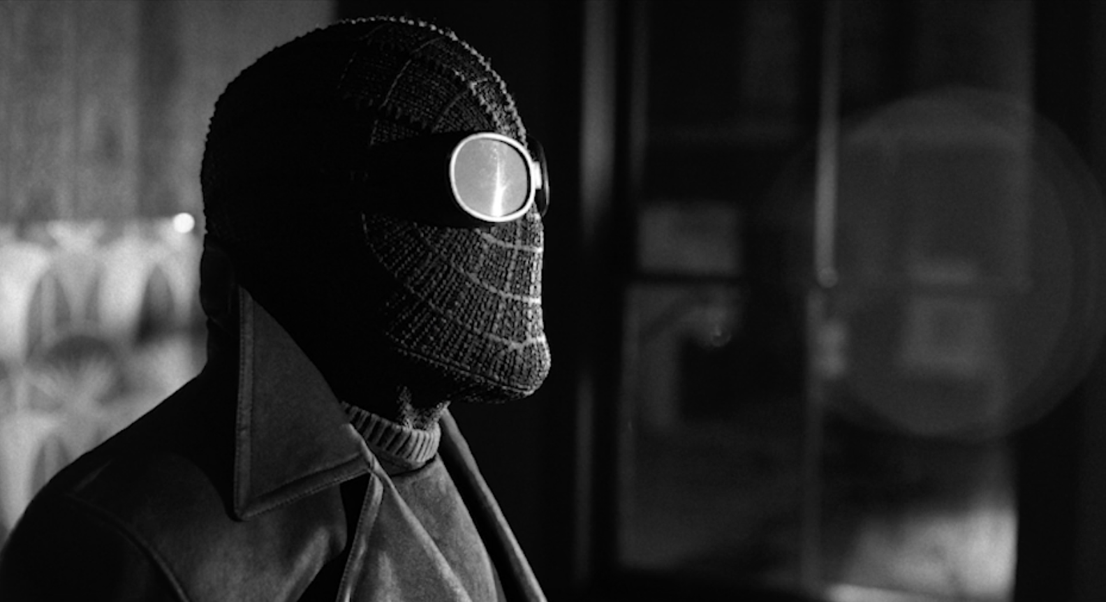
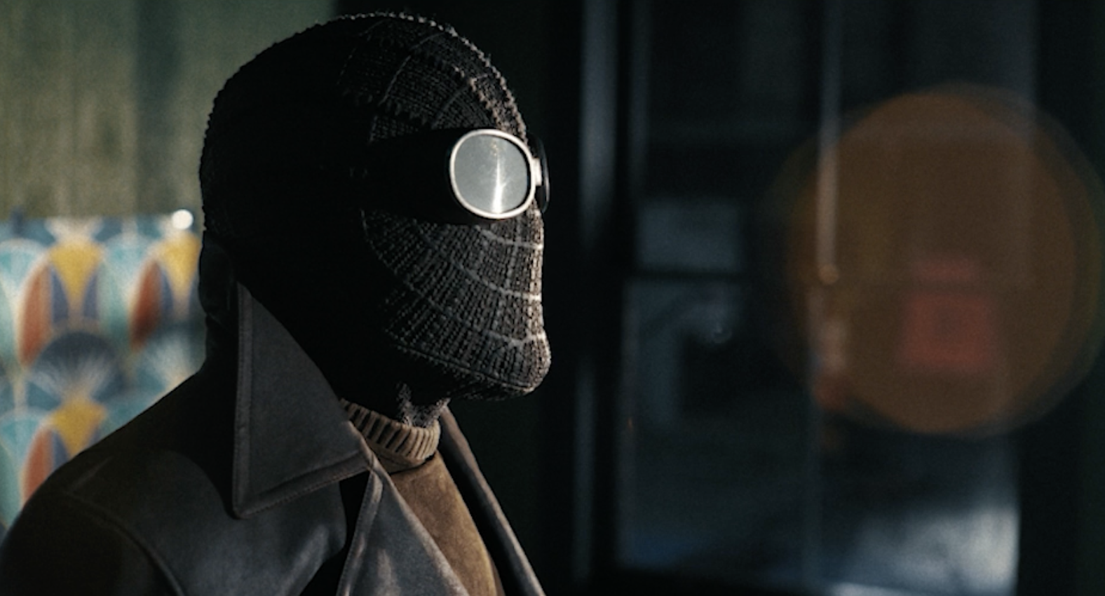
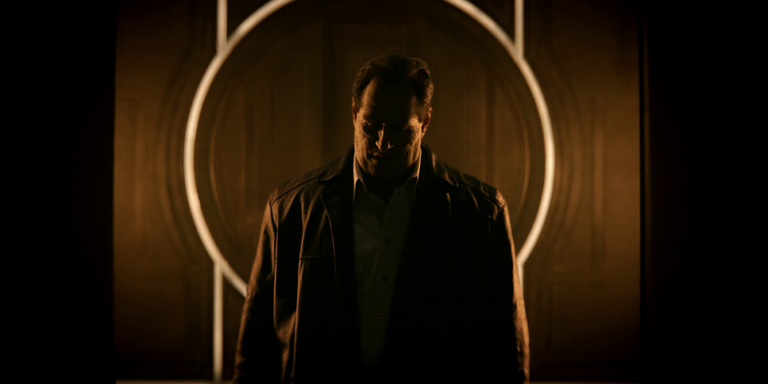
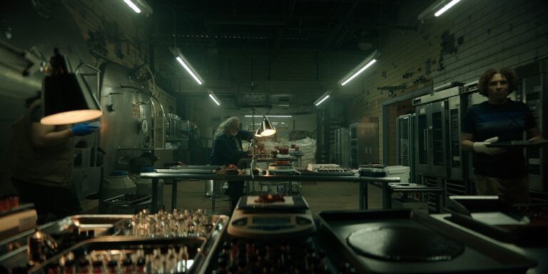
The duo most recently collaborated on Spider-Noir, which follows follows Ben Reilly, a down-on-his-luck private investigator whose latest case pulls him back into his former life as the city’s only superhero: The Spider.
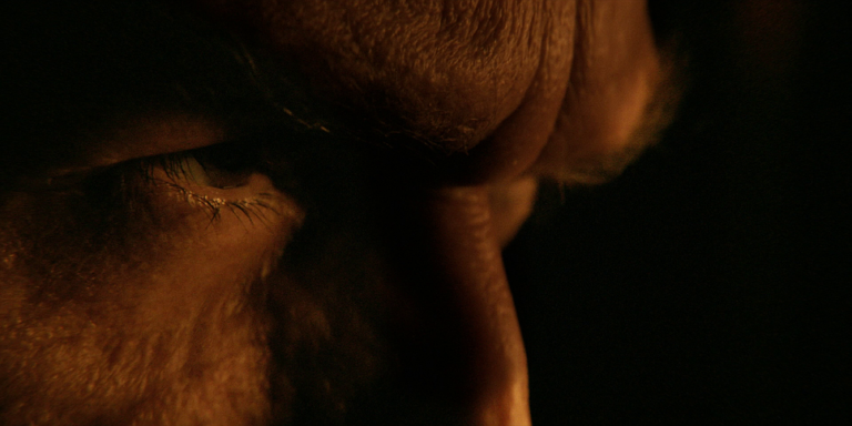
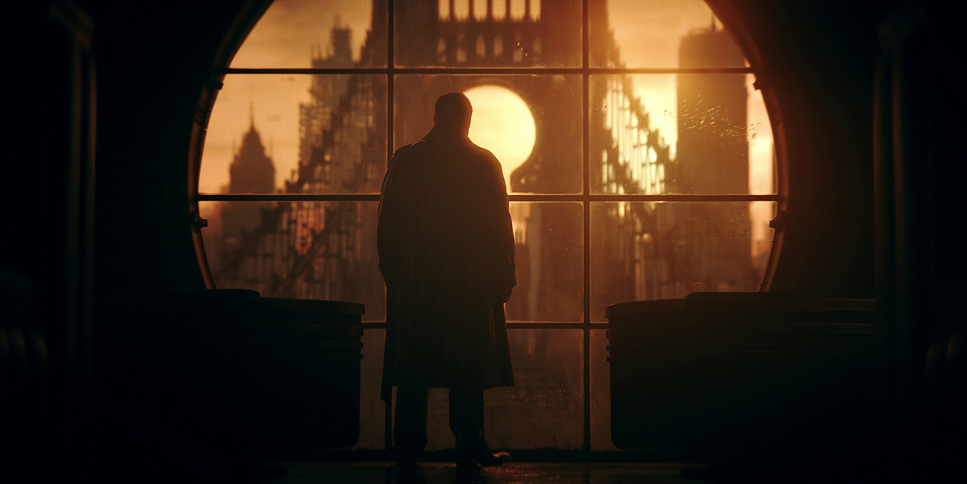
Darran and Pankaj sat down with Christian Hurley to discuss their collaboration on Spider-Noir, the process of shooting the series in both color and black and white, and the visual inspirations they drew from to bring one of the year’s most anticipated comic book adaptations to life. You can see a selection of their work below.
This article has been edited for clarity and length.
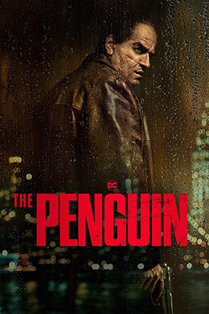
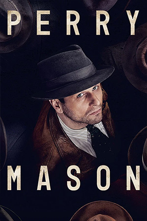
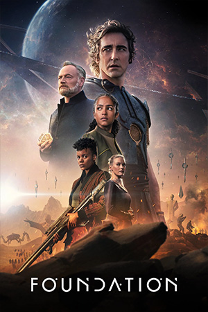
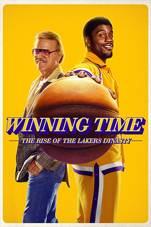
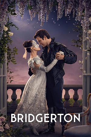
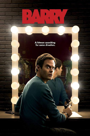
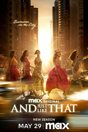
Congratulations to you both on another successful collaboration with Spider-Noir! This series follows your work on the critically-acclaimed series The Penguin. I’d love to learn about how the two of you met initially?
DARRAN: I met Pankaj when I came on to Perry Mason. David Franco (cinematographer) was about to start shooting with Tim Van Patten (director). Pankaj had worked closely with David before, but I immediately saw a kindred spirit when I sat down with him. I think you reminded me a little bit of myself, Pankaj. I’m from Dublin, where it was hard to work on films, especially when I was growing up in the nineties. It was only just starting to happen when My Left Foot, Jim Sheridan‘s film, came out and put us on the map, shot by the great Irish cinematographer Jack Conroy. But the dream of wanting to work in movies was very similar for both of us, and we also love the same photographers. Sometimes we talk more about photography than we do about coloring, because it’s all part of how the project should feel, and I think that’s the thing that’s very special between us.
PANKAJ: Yeah. I think that’s it. Very well put. That is the core of what immediately got us and we never looked back.
Who were the photographers that you bonded over?
DARRAN: So many. Ernst Haas. Gordon Parks. Robert Frank. Gosh, I could go on and on. Henri Cartier-Bresson as well. I don’t use movie references when I’m in prep. I tend to use photographs, and it’s interesting because it’s a still image and you’re trying to imagine what it would feel like if it was moving. For Spider-Noir, obviously, we had so many beautiful references for black and white film noir, but there was also a book that both of us fell in love with very early on called The Colors of Life, which is full of incredible restorations of color negatives and prints of autochrome photographs from, I think, 1886 onwards til the 1920s.
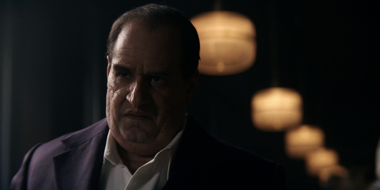
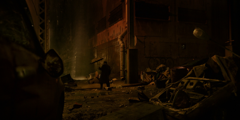
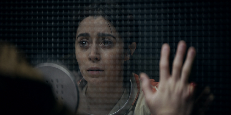
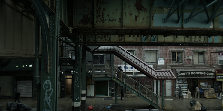
If you go back to The Penguin, obviously, the influence is Greg Fraser‘s beautiful cinematography in The Batman, but we also wanted to extend that universe. So things like Gordon Parks’ The Atmosphere of Crime became a touchstone for the show, especially since The Batman was 90% shot at night, while The Penguin lives in the shadows of daytime.

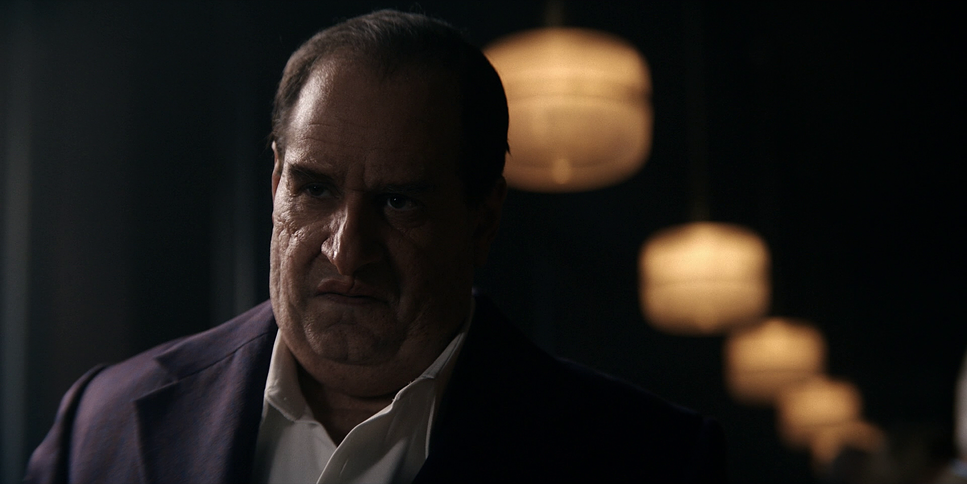
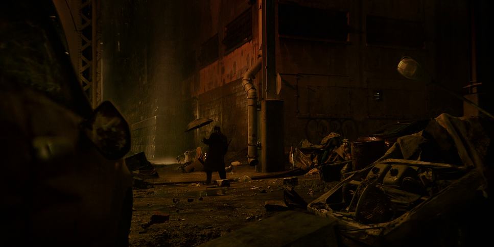
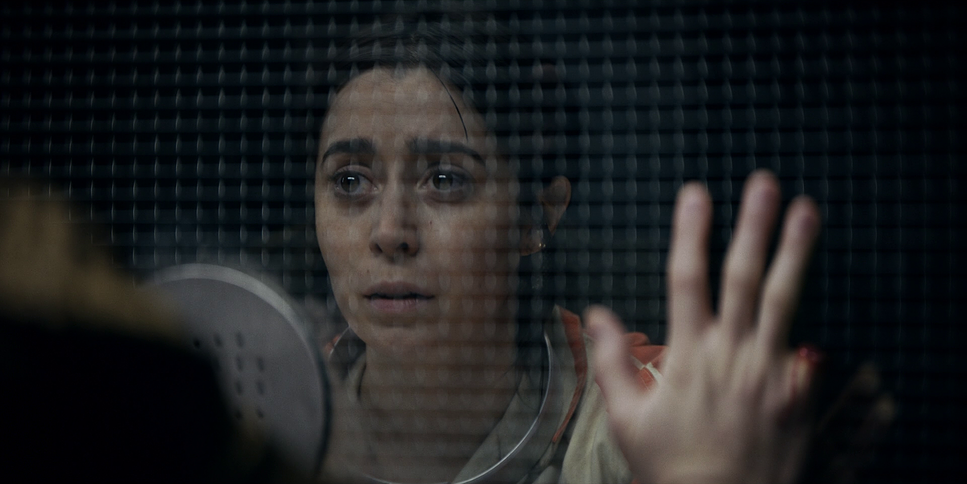

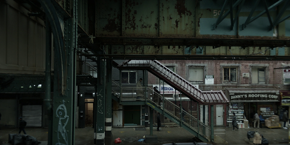
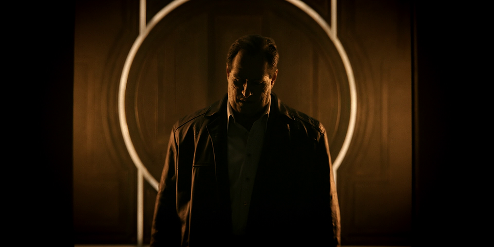
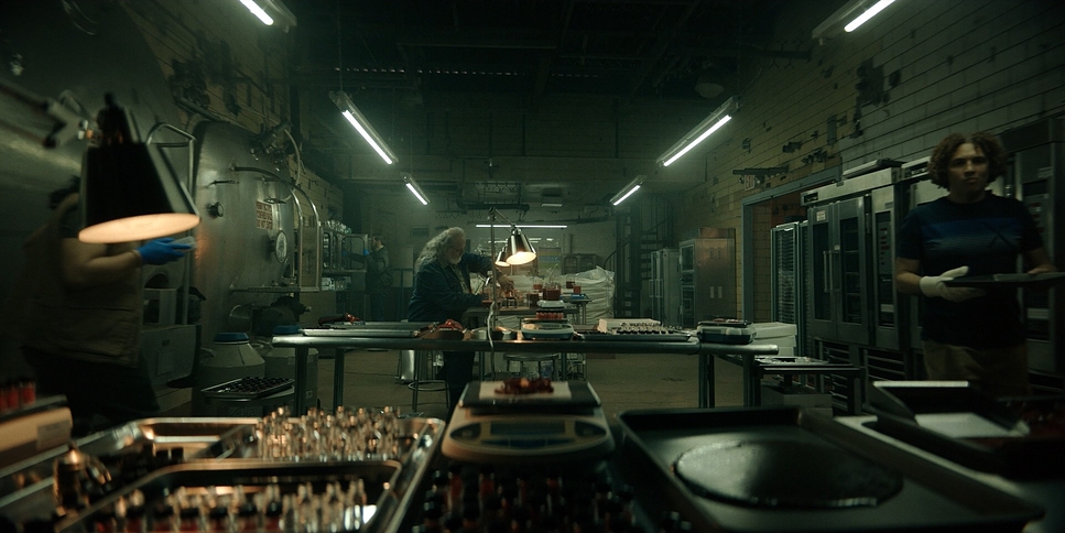
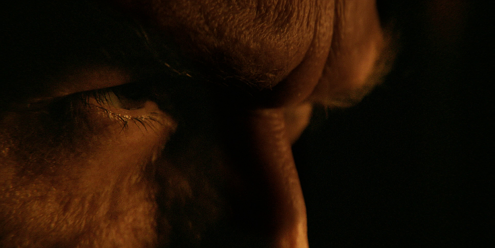
This is the second time the two of you have worked on a gritty comic book crime series. How did finding the look for Spider-Noir compare with The Penguin?
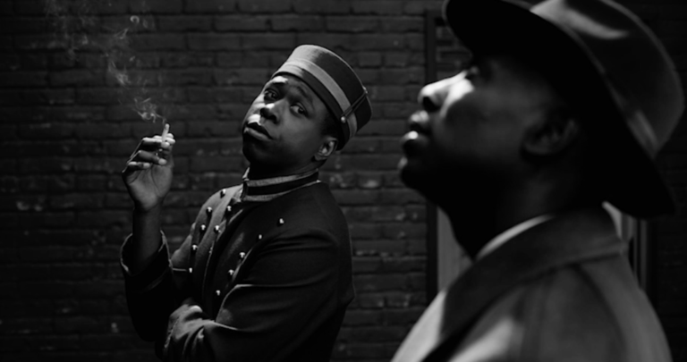
DARRAN: I think withThe Penguin, a huge influence was The Batman’s photography, but we also wanted it to stand up on its own and be the Penguin’s story. A film that resonated with me when we were in The Penguin was The French Connection. With Spider-Noir, we weren’t striving for realism at all. We were striving for something that was glamorous, romantic, and slightly dangerous.
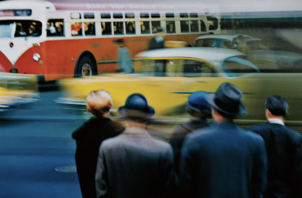
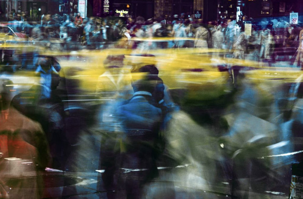
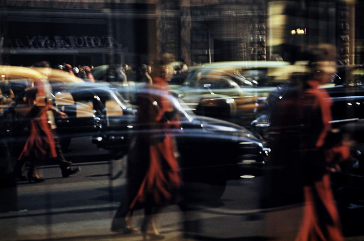
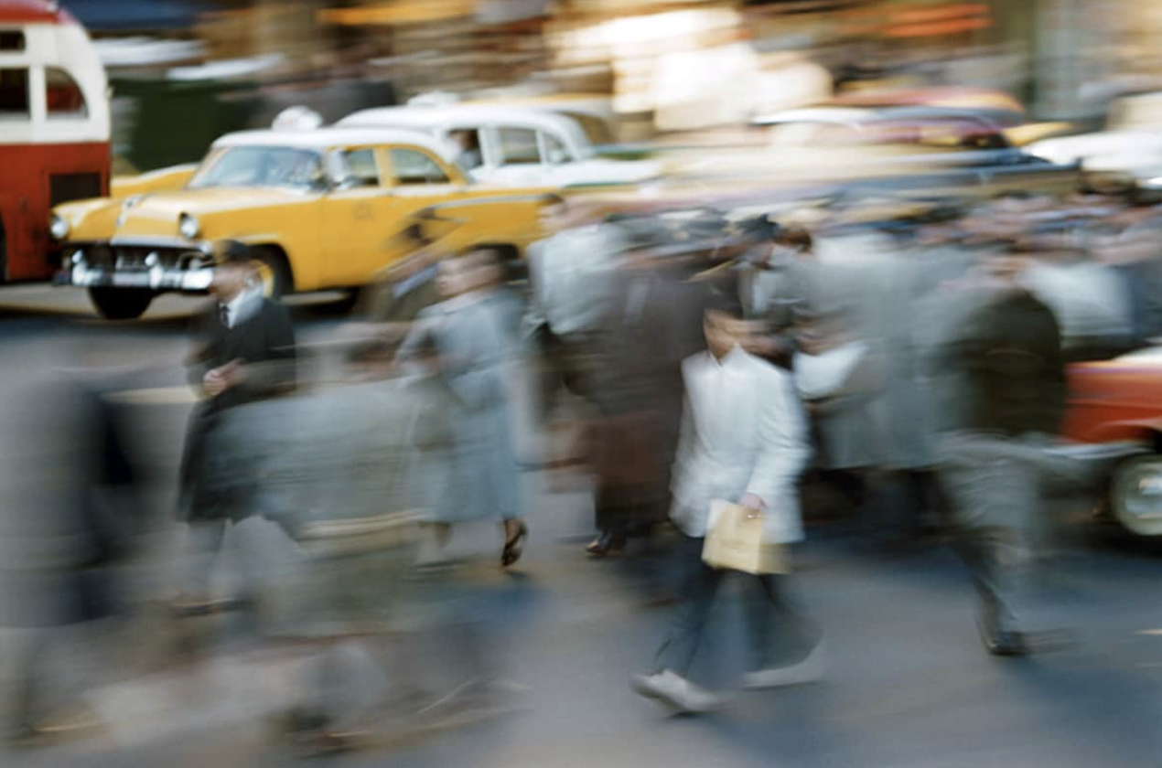
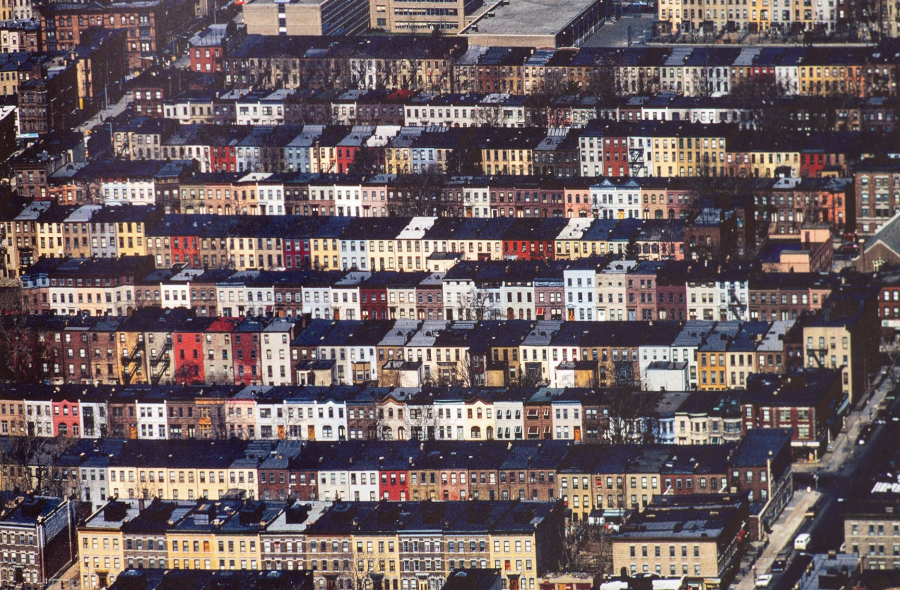
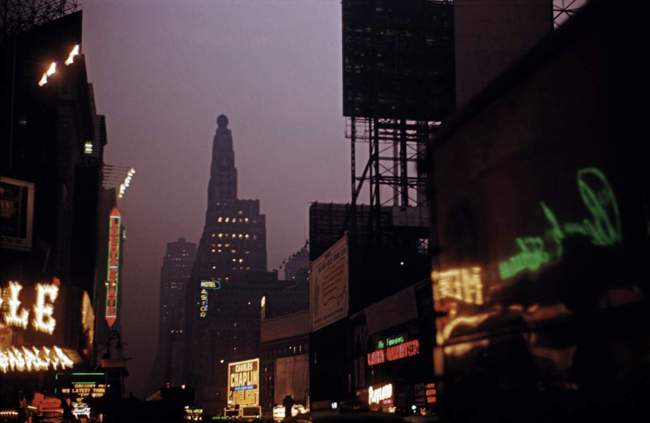
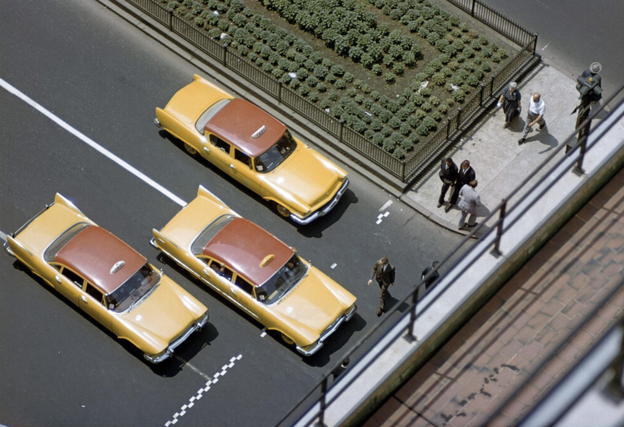
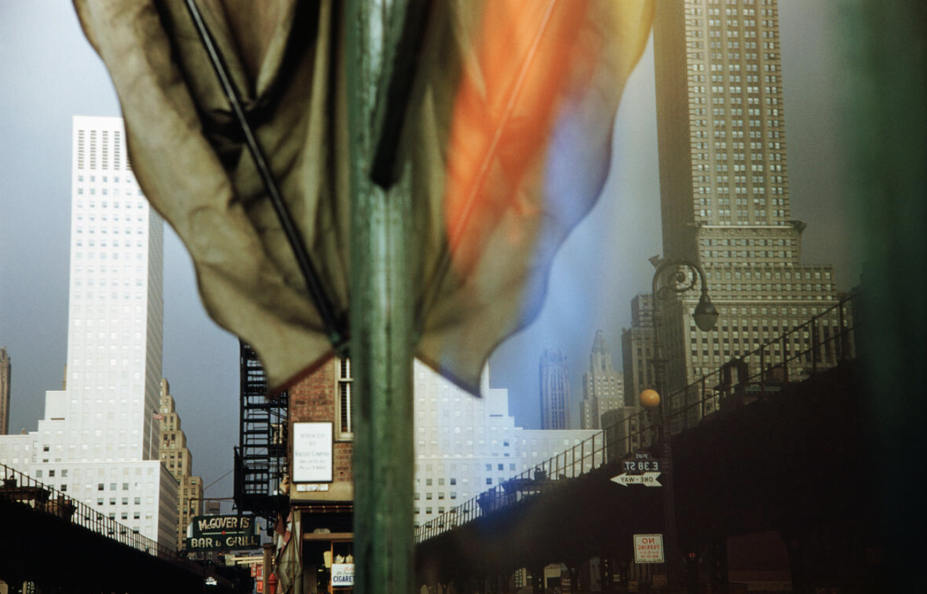
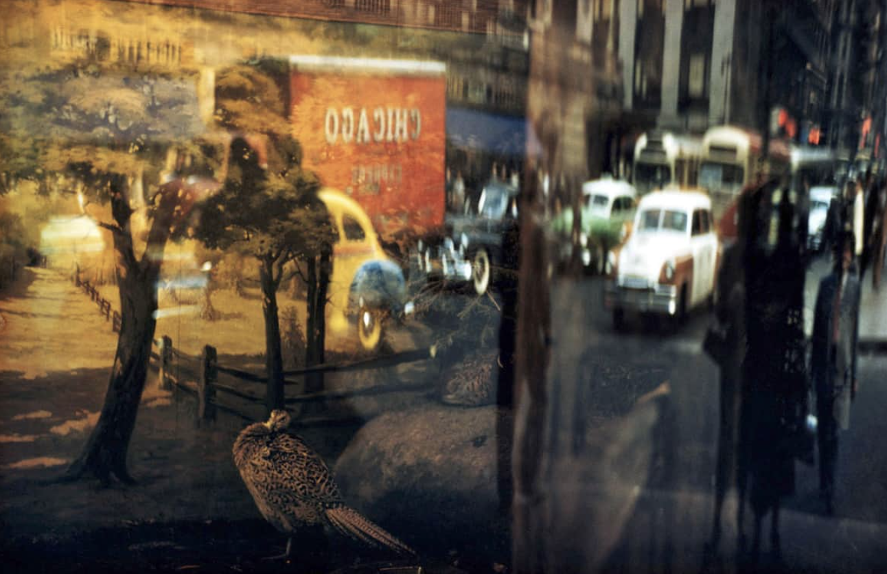
PANKAJ: When we were doing The Penguin, it was about realism. I go back to the book of Ernst Haas’s photographs in New York that just got published around that same time. It had his photography of New York from the early color days, when Kodachrome film was 25 ASA or so, where he was working with those kinds of limitations. But the images that were created were real and they had something of a character of New York itself from that time, and it kind of wonderfully dovetailed into The Batman‘s imagery.
Below are some images from Ernst Hass’s photography of New York.
On Spider-Noir, you and the creative team all had a similar starting point on the show, rather than the costume and production designers starting earlier, right?
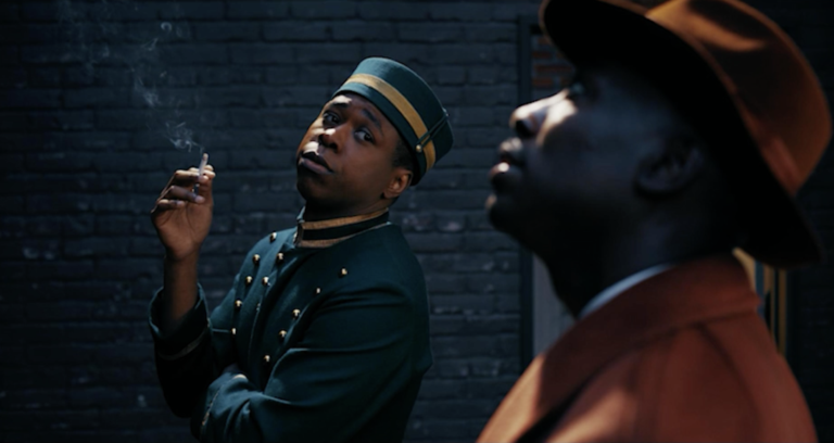
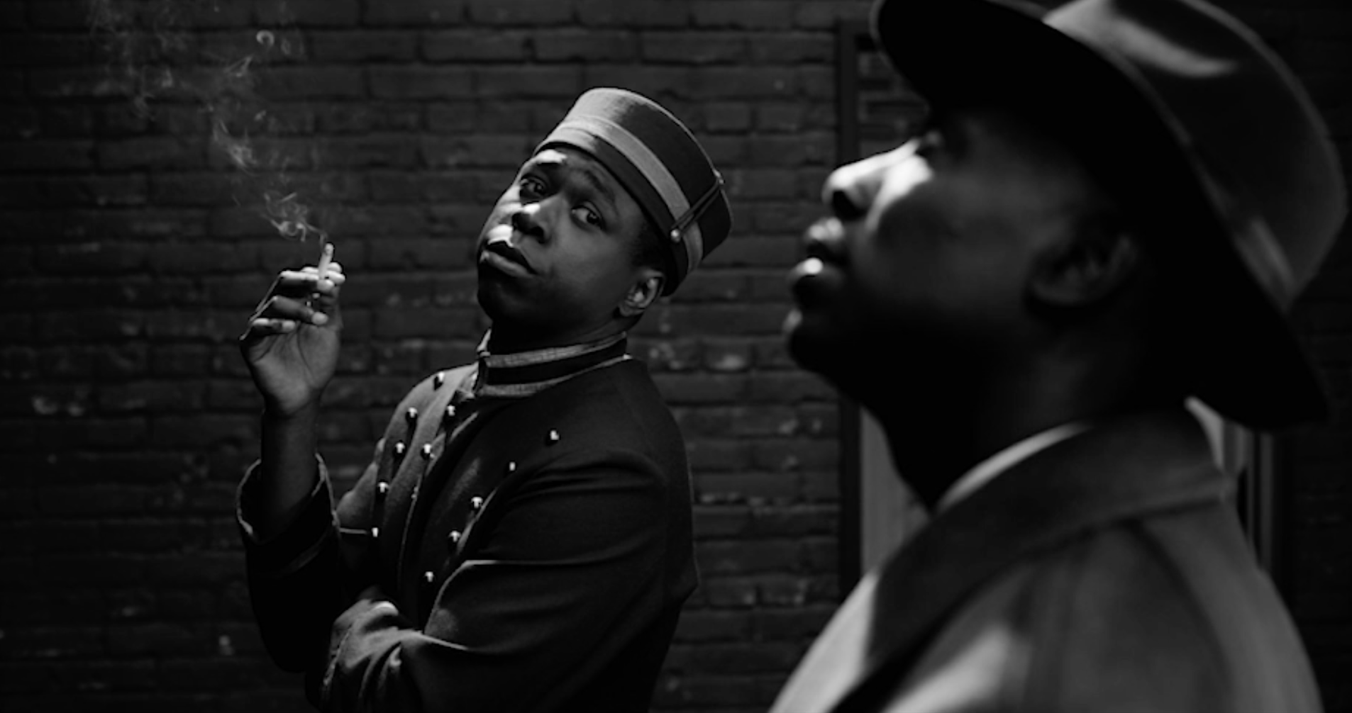
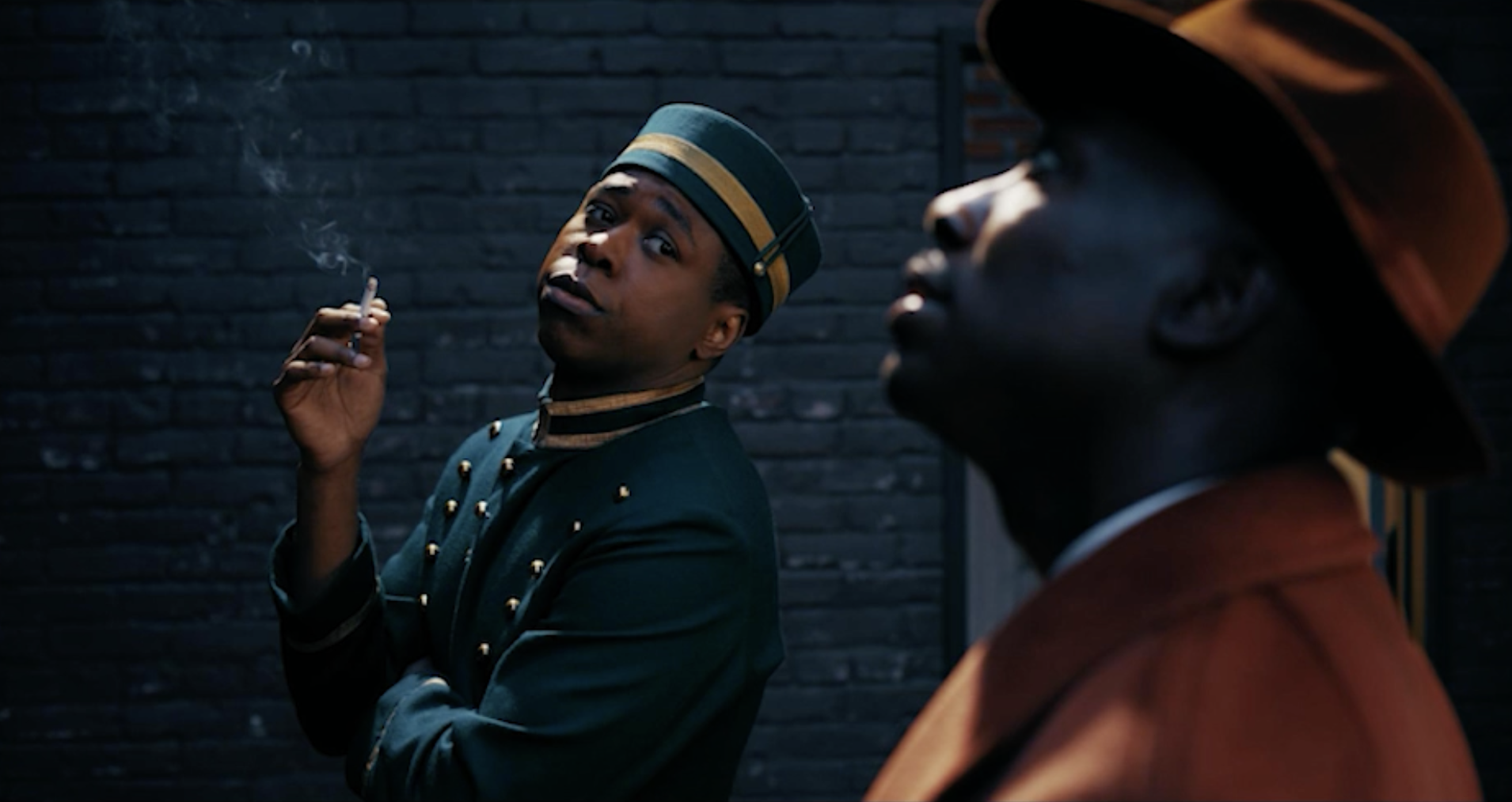
DARRAN: Yes, which I suggest for any future production. Bring your colorist on board as well. You get to create LUTs and that’s your personalized film stock in a lot of ways, which is a huge benefit to cinematographers when you’re shooting in so many different environments. I’m shooting on film again at the moment, so now I change film stocks depending on the environment that I’m in. On Spider Noir, we decided to keep it simple, you know, have two different black and white LUTs and one color LUT.
We had a softer grade that was very similar to the older British film stock, Ilford. Ilford is still available in stills, but it was a movie stock as well. Then we had the classic, Kodak, which is a bit of a mixture between Super XX and Tri X. That was really important because then you could create the lighting knowing where your boundaries were and where you were going to go with it and push it.
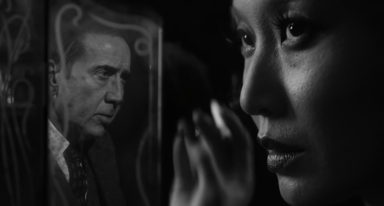
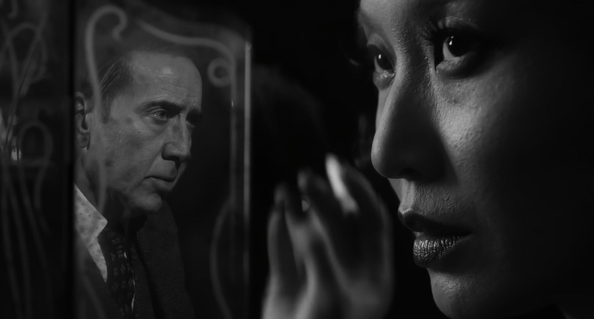
PANKAJ: One of the unique things we started with was the mathematical formulas for those film stocks. But then Darren and I put our spin on it, because obviously we had the Sony Venice to deal with in terms of the digital acquisition.
DARRAN: We did many many tests to discover how a black and white LUT and a color LUT could coexist with the same type of lighting. I think compositionally it would always stand because it’s film noir and you have the ability to express yourself in very bombastic ways sometimes. When we got to a place where we were happy with both looks we got Sony FX cameras, which have the same color science as the Venice 2’s, and we put one in each department with a lighting setup similar to what we were using with older units like older tungsten fresnels and open faced tungsten units. Very rarely did we use modern equipment. Each department could flick between the black and white and the color looks, and place as many things in front of the camera as they wanted. So there was always this cross reference between everybody, and we’d review the footage and very quickly we all were speaking the same language. So when we started to shoot, it was very smooth.
I’m so interested in your testing process for this series, because you were asked to imagine what the black and white version would look like in color rather than the other way around, right?
PANKAJ: Yes. Darren took a black and white shot and colorized it, and everybody was like “yeah, the show needs to go there.”
DARRAN: There was one particular black and white image from Stanley Kubrick‘s The Killing which was a huge reference. There’s a scene where the main heist gang is meeting, and it’s just lit with a single light bulb on a shade above a round table. I’m no expert in Photoshop, but I learned how to mask around the frame and color it. I got pretty fast at it, and actually Pankaj brought some of those stills into his color bag. Then we started shooting tests with a very tiny crew on the Sony lot. We had beautiful costumes, amazing stand ins, and great spots around the studio lot that were very noir-ish that Warren had picked as well.
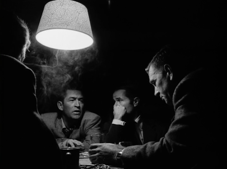
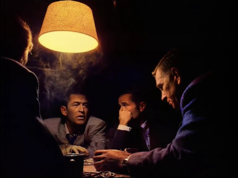
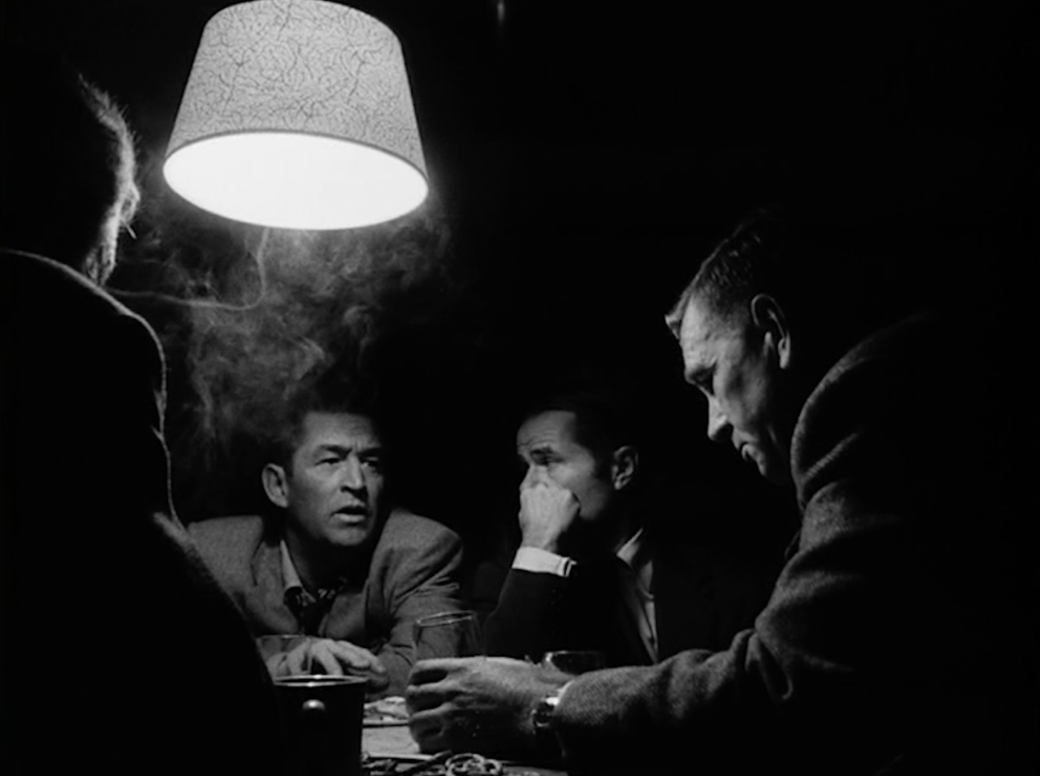
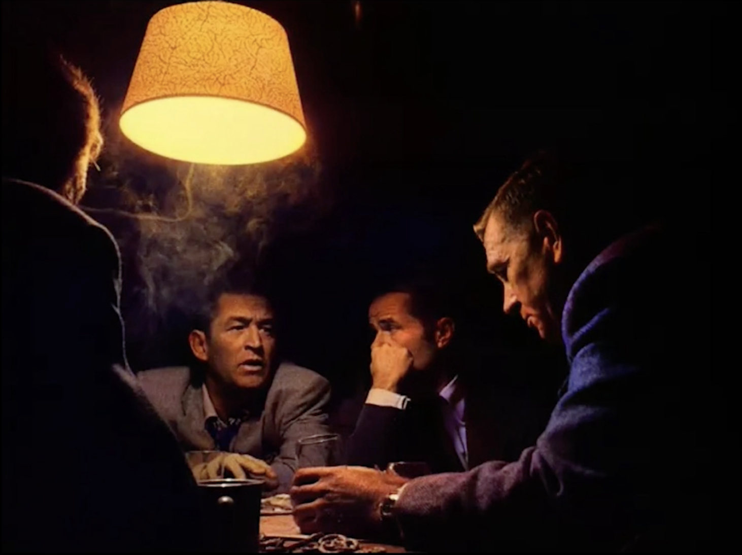
We actually shot some scenes early on. We shot for two days maybe a month and a half before we actually started shooting? That was so brilliant because we had the actors and we had the real sets and it was in-between principal photography. That was the test where everything snapped together, and we made our road map and went off to start shooting. Pankaj would make adaptive tweaks to our LUTs, but we did the color pass first and then we did the black and white episodes, so Pankaj had to do the show twice. The color was important to do first because it was actually more complicated than the black and white in lots of ways. Whatever you would do on a color scene would never transpire to the black and white. It was never a carbon copy.
PANKAJ: I think this was a conversation Darren and I had at the very beginning. When black and white films were shot, oftentimes, the photography involved the use of colored filters. So, you know, it was either a red filter to darken the blue sky or a yellow filter to lighten flowers or give luminescence to the grass by putting green filters and so on. That was always in the back of our minds.
Going back to the very original question of why Darren and I work well with each other, it’s because of lighting, composition, and texture. Those are the things that we don’t have to talk about. They just happen instinctively between our initial conversations, his photography, and then when we get to the finish. So those elements were layered into the reinterpretation of the color world of Spider-Noir from the black and white.
Were there any color film noir films that you referenced at all in this journey?
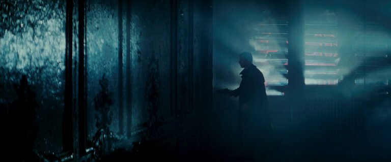
DARRAN: Blade Runner. The use of beams of light, and it is a detective story after all. Even though it’s set in the future, it was a huge touchstone. During the process of maiing Spider-Noir, I discovered a really beautifully curated crafted black and white version of Blade Runner that I think is still available on Youtube. It stands up so well in black and white and still mesmerizes me.
In our other interviews with Picture Shop colorists, frequently the discussion will turn to color and it’s relation to emotion. Were there any specific hues that had deeper thematic meanings in the color version?
DARRAN: Yes. Warren Alan Young, our Production Designer, linked certain colors to characters early on that would work in black and white in tonality. For example, Nicolas Cage‘s color is teal blue. It’s his apartment color. Li Jun Li plays Cat Hardy, so there was definitely a tinge of blue there too. But there’s also an amber and gold around her the first time you see her in the dress in the nightclub scene. You don’t know it’s gold until you see the color version, but it has quite an impact visually.
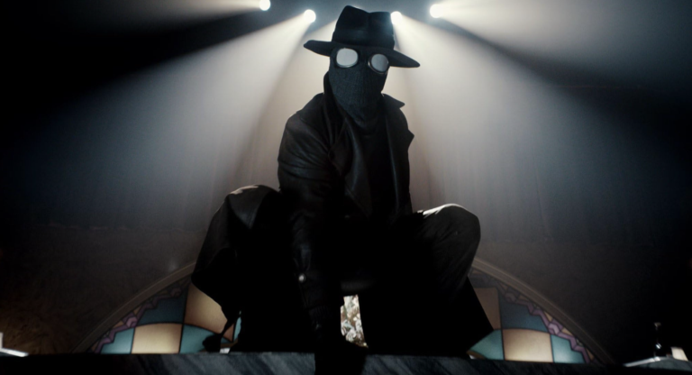
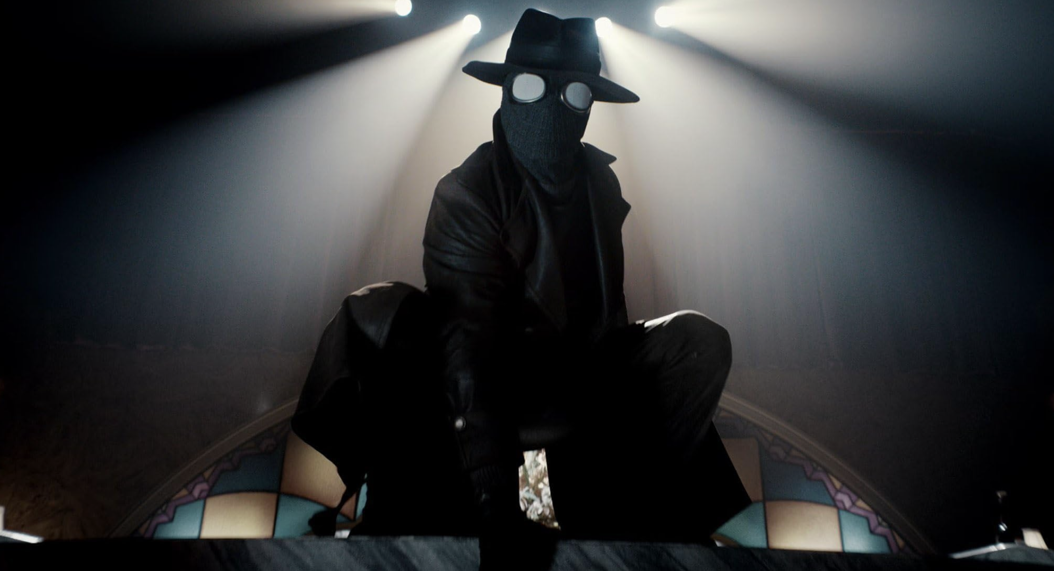
PANKAJ: Our showrunner and fearless leader, Oren Uziel, was the one who encouraged us to just keep going until we got to the breaking point. That gave us so much freedom, because obviously color, lighting, everything has to do with emotion. But in this particular case, we were looking for something that was unique. How do you find something that appeals to both color and black and white? We started experimenting with all kinds of things, like blending the 3-strip color process with early Kodachromes and blending it with the newer Ektachrome. In the end, [Ben Reilly] is a comic book character. I mean, it is a show that has to resonate with the comic book fans. You know? We had some really great people pushing the cart.
DARRAN: Absolutely. Part of my feeling about it was “I want this cinematography to be as exciting as Into the Spider-Verse”. It’s a colorful movie with amazing compositions and scenes. So when you’ve got Phil Lord and Chris Miller egging you on and giving you encouragement and saying “let’s see where we can go”, it’s a brilliant feeling.
What advice do you have for somebody who might be trying to tackle a film noir project today? Was there something you didn’t expect to be difficult that proved challenging, or something that was easier than you thought it would be?
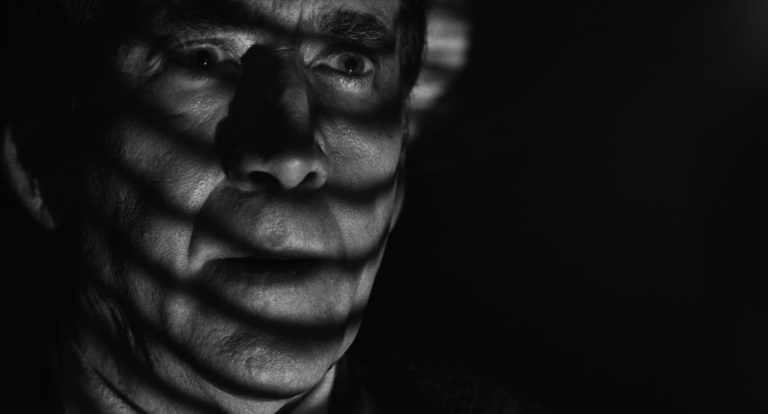
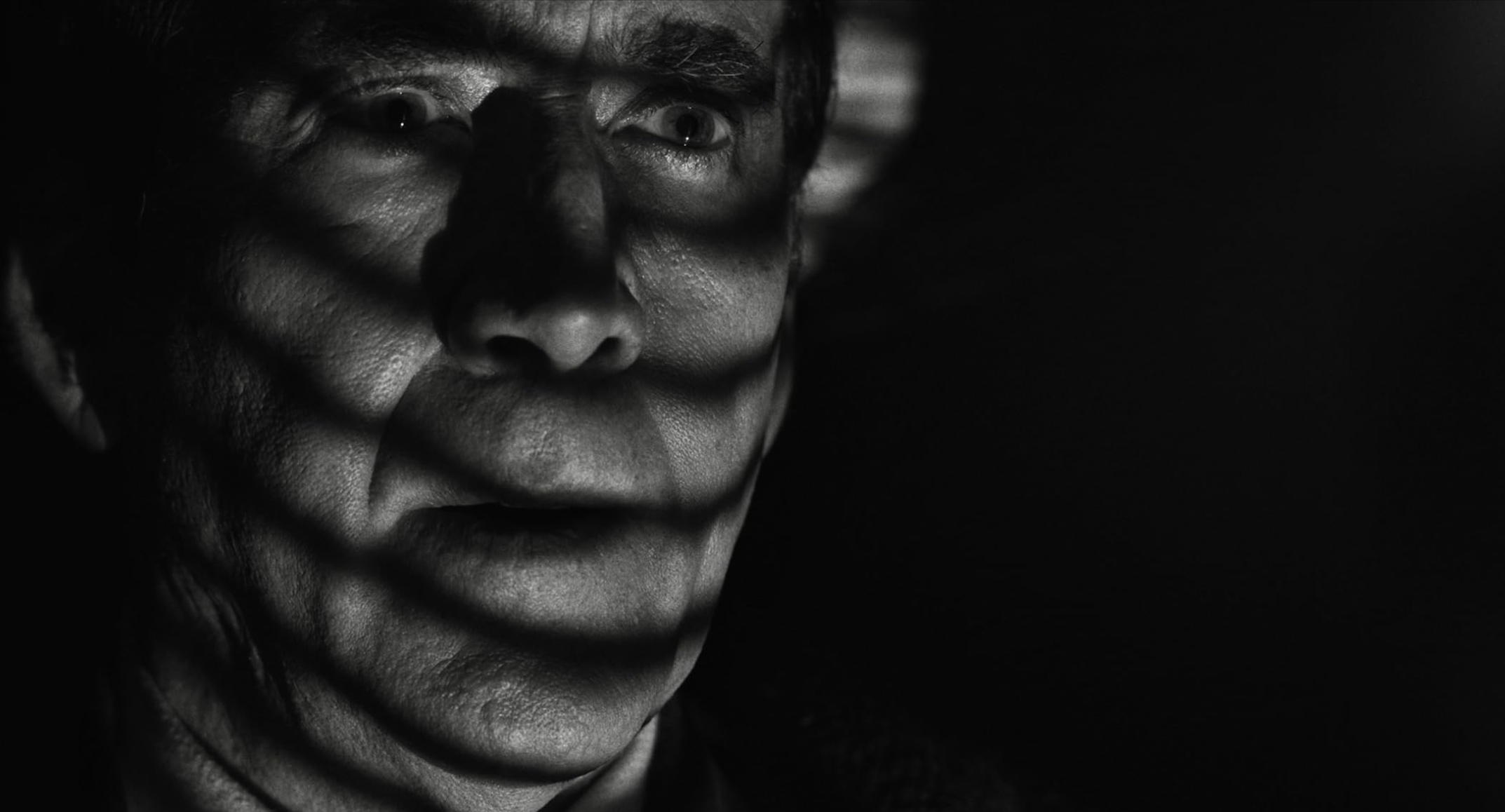
DARRAN: As a cinematographer I rely on instinct a lot when I’m reacting to a scene that we’re going to photograph. I think with film noir, you have such freedom to express yourself through the cinematography and help the expressions of the actors. I think the thing I learned, which was very comforting to me as a cinematographer, was that film noir is all about psychology. It’s all about emoting feelings. How do we emote it through our use of composition and lighting?
Every single one of those actors is incredibly talented, and I really felt, especially just photographing Nic Cage, very much in sync with what we were doing with our compositions and our lighting through his actual performance. So one advice I would give is just go for it. Be bold, you know? We were always wary that we didn’t want to create parody noir homage. We wanted to become part of the film noir family rather than make a jokey version of it.
How did you find that line? Between homage and real noir?
DARRAN: Sometimes the use of dutch angles can be a little bit much, and then when it’s edited together it doesn’t feel cohesive, so you have to be careful of that. We often did use Dutch angles, but only once in a scene, maybe twice? I think you can’t overuse that language because it doesn’t work cohesively in a whole scene, and that comes very much from having amazing operators who are in tune with that. We never wanted anybody to be aware of the camera overpowering the performance. Film noir films are very economical. They tell you the story in a couple of shots, and that was definitely part of our approach as well.
Pankaj, on the color side, you talked about Oren Uziel wanting you to push it as far as you could go. Are there any specific examples you have of that breaking point?
Technically, both in SDR and HDR, we were always on point. I’m fortunate enough to be working on a Baselite system, and they actually came through with some newer features that they’re putting into their system. One is called a Chromogen, which is based on chromogenic prints. They also have something called an X-grade, which involves taking the secondaries and putting them on steroids without having the artifacts and problems that come with typical secondary color correction. But I was very fortunate to actually really take these new features for a spin and not have artifacts, contamination, compromised skin tones or anything like that.
What is one lesson that you learned from this project that you will take to the next one?
DARRAN: I think I learned how to collaborate much deeper than I have done in the past, whether it be with props or costume or art departments, locations, or even transportation. It’s all a collaboration, and I think I really like to feel that everybody feels like they’re working on the same project and proud of what they’re doing.
PANKAJ: I couldn’t have said it better than that.